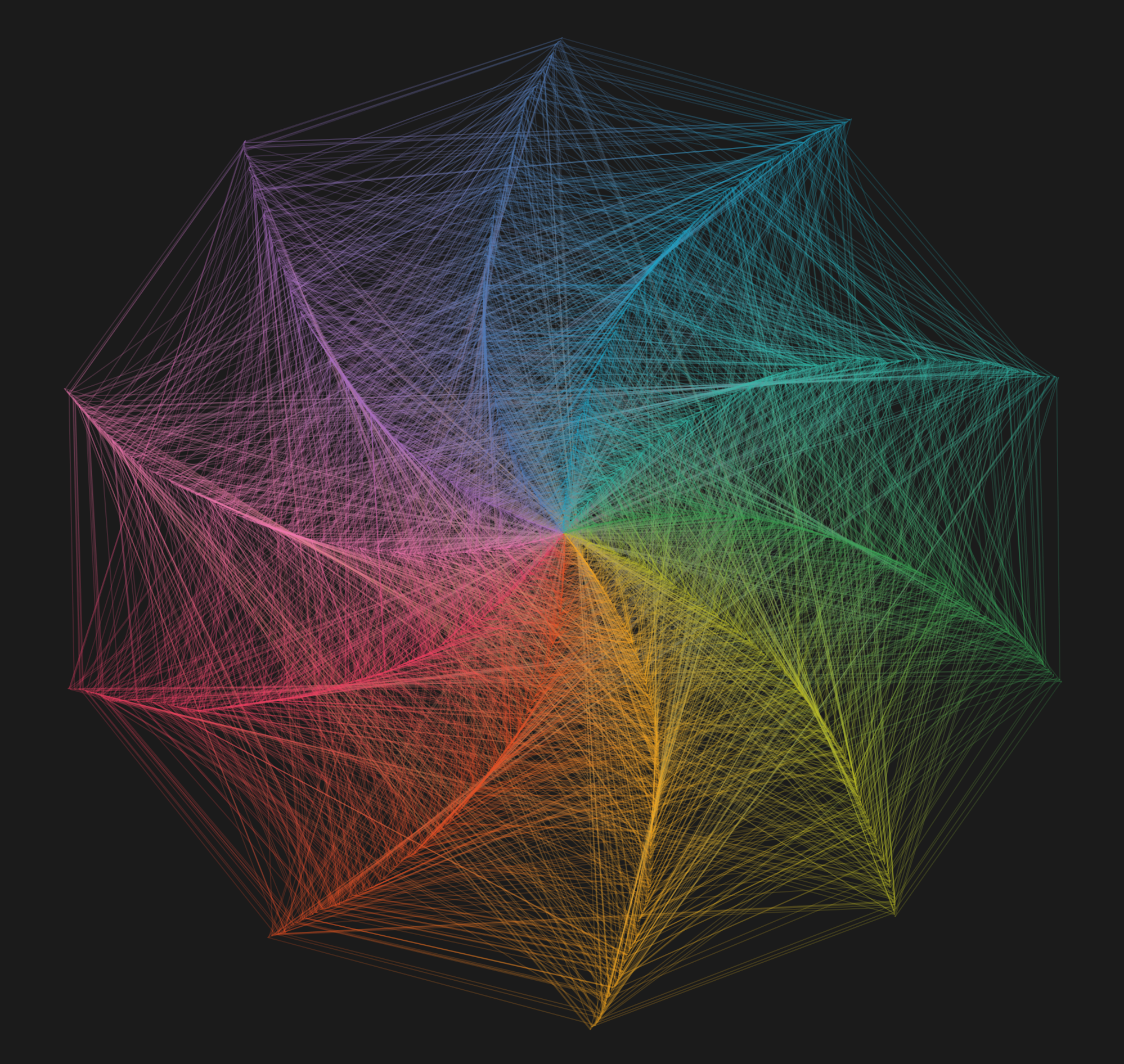
In my continued quest to create curved art pieces using only straight lines, I recently came across this series of Pi Art pieces created on Tableau and was so enamoured by Chris Love's design below.
And as one does following such moments of awe, I tried to reverse-engineer it.
The Tableau workbook was, thankfully 😌, available for download. But just looking at the data structure, I couldn't make any sense of it. So I worked from two clues: the caption ("The visualisation shows the first 5,000 digits of Pi... Each line connects one digit to the next. Each point expands outwards as the digits progress") and the fact that the piece is made entirely of straight lines, even though the viz as a whole seems to have curves in it.

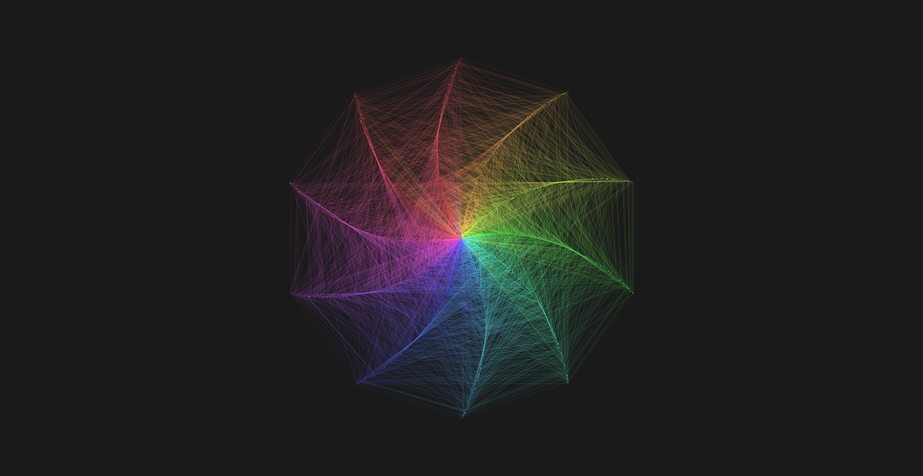
Below is my recreation:

I also thought to take advantage of p5.js's versatility to add motion, slowing down the first fifteen or so lines to let you see exactly how they're drawn. My version also differs in a couple of ways: it takes up a larger canvas (after some experimentation, I ended up using a little over 7,000 digits of pi), and the lines contract inward rather than expanding outward as the digits progress.