I created this visualization, "Death from Natural Disasters" , for a Makeover Monday challenge, a community initiative where participants redesign existing charts for better clarity.
The original, by Our World in Data, used a bar chart to track deaths from disasters over time (decadal averages) and a separate tab with a map for geographic breakdowns. My first impressions?
Zooming out, I made a note of questions I was curious about:
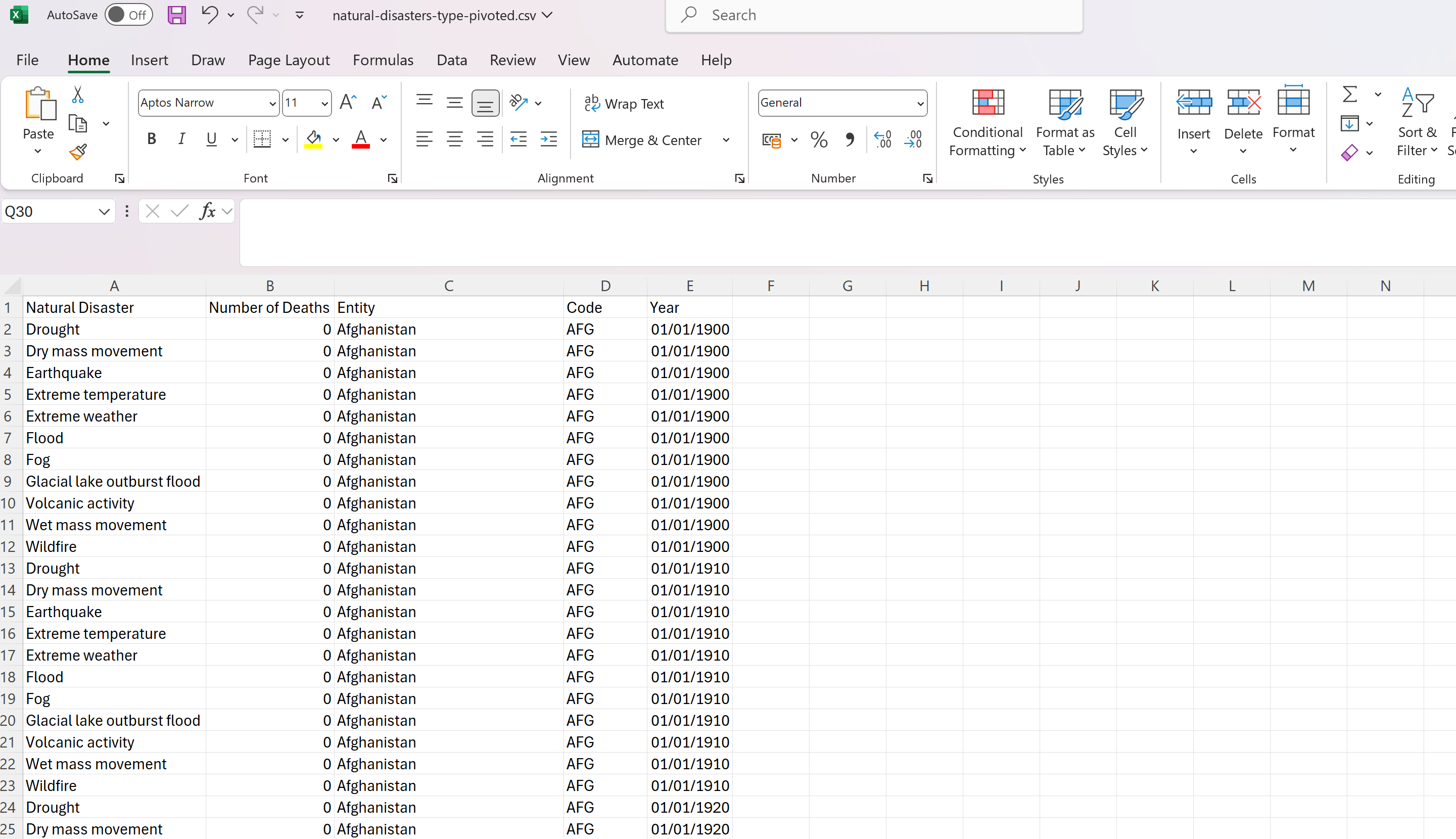
I brought the data into Tableau to explore it with some simple charts. Almost immediately, I noticed it needed tidying: the dataset was wide, not long (the best format for analysing in Tableau). A quick pivot in Tableau Prep fixed that, setting me up for analysis. Early findings that stood out were:
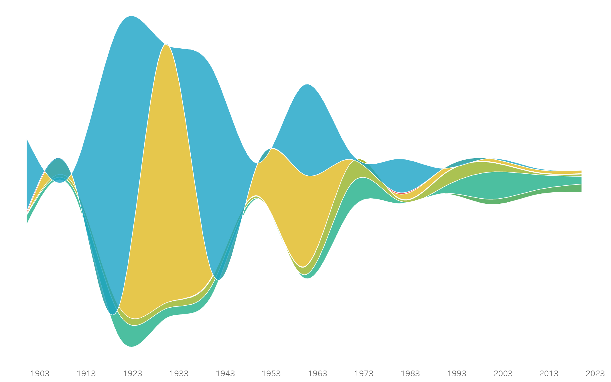
What chart could bring these insights to life? A timeline with annotations for key years felt like a start. Then I thought of the stream graph, like the one in The Ebb and Flow of Movies from the NY Times. I created one using LaDataViz's extension . It captured the decline in a more compelling way than the bars in the original, but I wanted more: a yearly breakdown and a regional lens. I'd also been thinking about "data individualization"—disaggregating data to tell individual stories—inspired by Nadieh Brehmer and Soha Elghany. A filterable, human-focused viz started to take shape in my mind.
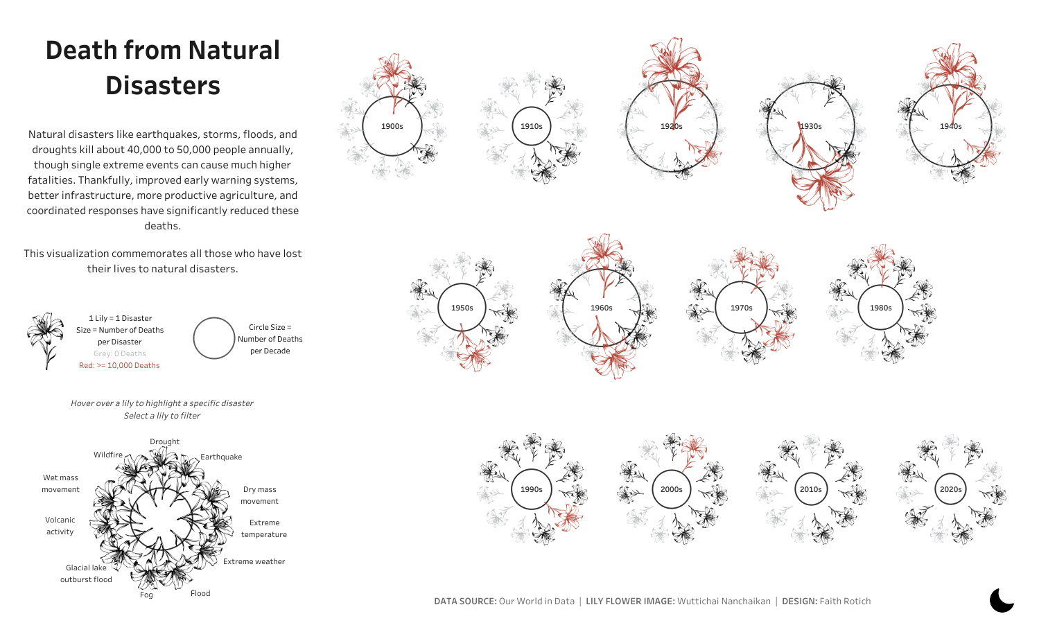
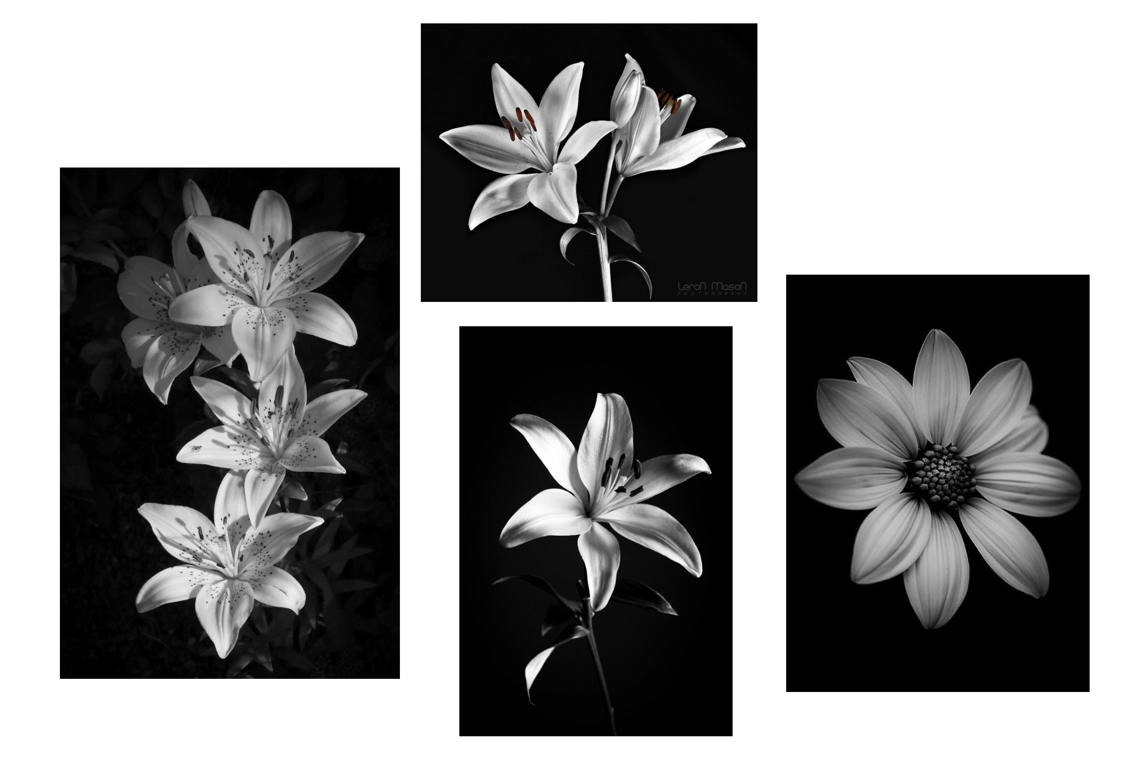
As I turned to design, I stepped back to think about the bigger picture: how to depict death in a visualisation. It's a sensitive topic, and I wanted to be mindful that these aren't just any numbers but lives lost. Almost immediately, I thought flowers would be a fitting way to represent the data. I'd been eager to explore plant motifs in a visualisation for some time, and this felt like the right opportunity. I loved the idea of using flowers, especially ones connected to grieving, to shape the entire viz. But which flower? I did some reading and found, across various blogs, lilies and chrysanthemums stood out as the ones we often use when comforting loved ones in grief. White lilies felt most universal, and I thought would be easier to sketch than intricate layers of chrysanthemums.
I found a few images on Pinterest that I liked, brought them into Excalidraw, and started thinking through how to encode the data.
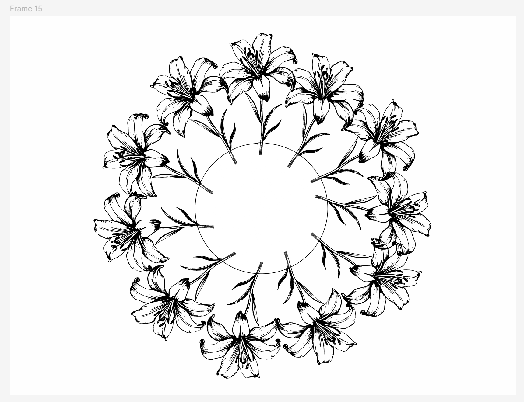
Each petal could represent one natural disaster.
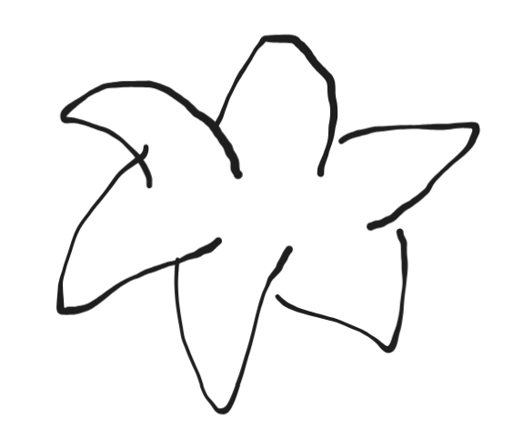
This seemed promising until I hit my first snag: I had 11 types of natural disasters, but lilies typically have only six petals (or, as I discovered after going down a fun rabbit hole, three petals and three sepals). That dive also revealed lilies have six stamens, which I thought could help. Perhaps petals for the top five disasters, stamens for the rest.
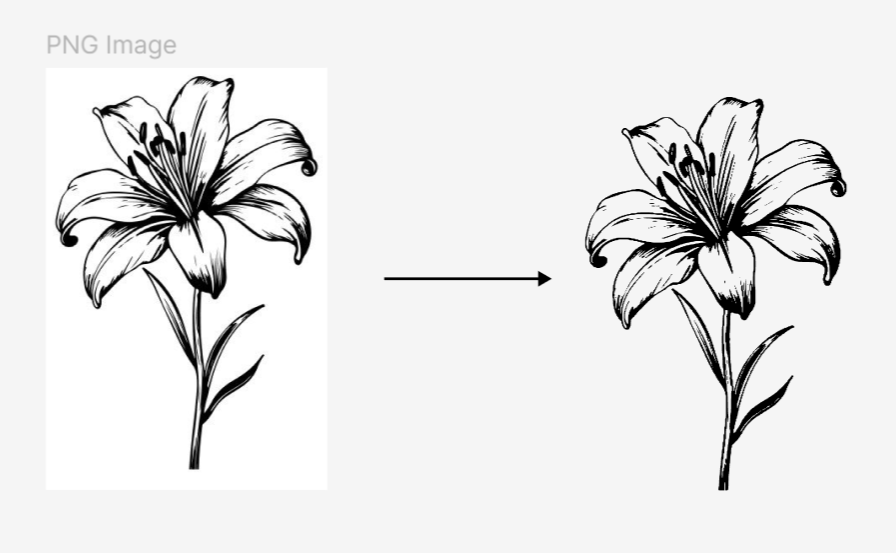
Then came the second snag: sizing petals by death tolls would distort the flower, with some petals shrinking to near invisibility, and stamens ballooning out of proportion. I eventually settled on colour, rather than size, to reflect the death tolls. (Now, writing this blog months later, I'm finding that there are over 2,000 varieties of lilies, and some, like Double Oriental Lilies, are bred to have more petals. Knowing this beforehand might have saved me tons of work! Or maybe not—I was more drawn to the variety tied to mourning.)
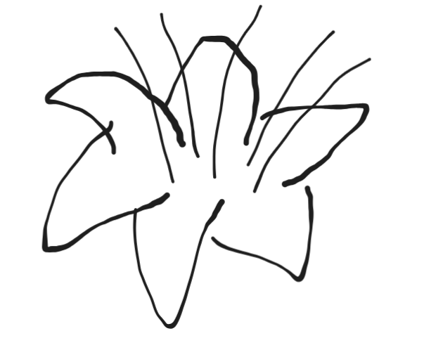
Next, I turned to Figma. Drawing flowers from scratch felt daunting, but I remembered seeing on Twitter Uduak Afang's blog on tracing shapes for her viz This gave me a starting point. I swapped my initial lily image for one with sharper outlines which was easier to trace. As I sketched, I realized I could extract its vector and get a far cleaner result than anything I could draw by hand.
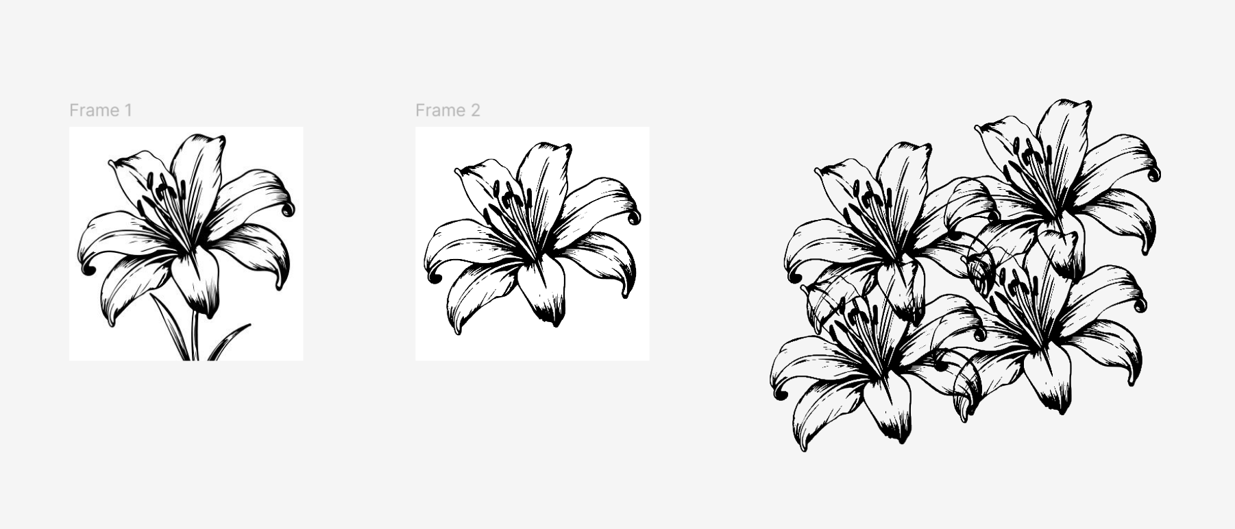
Then came another idea: what if each flower represented one natural disaster, gathered into a bouquet? But how would the bouquet look? How could I make each flower distinct so the encoded data would stand out? Oh, aerial view. As I started arranging the flowers from above, though, I hit another snag:11 flowers representing 11 natural disasters would overlap too much, muddling the clarity I wanted.
I tried a side view, but the problem persisted. Spacing the flowers apart helped slightly, but the arrangement still felt off. Was my insistence on a "natural" look holding me back?
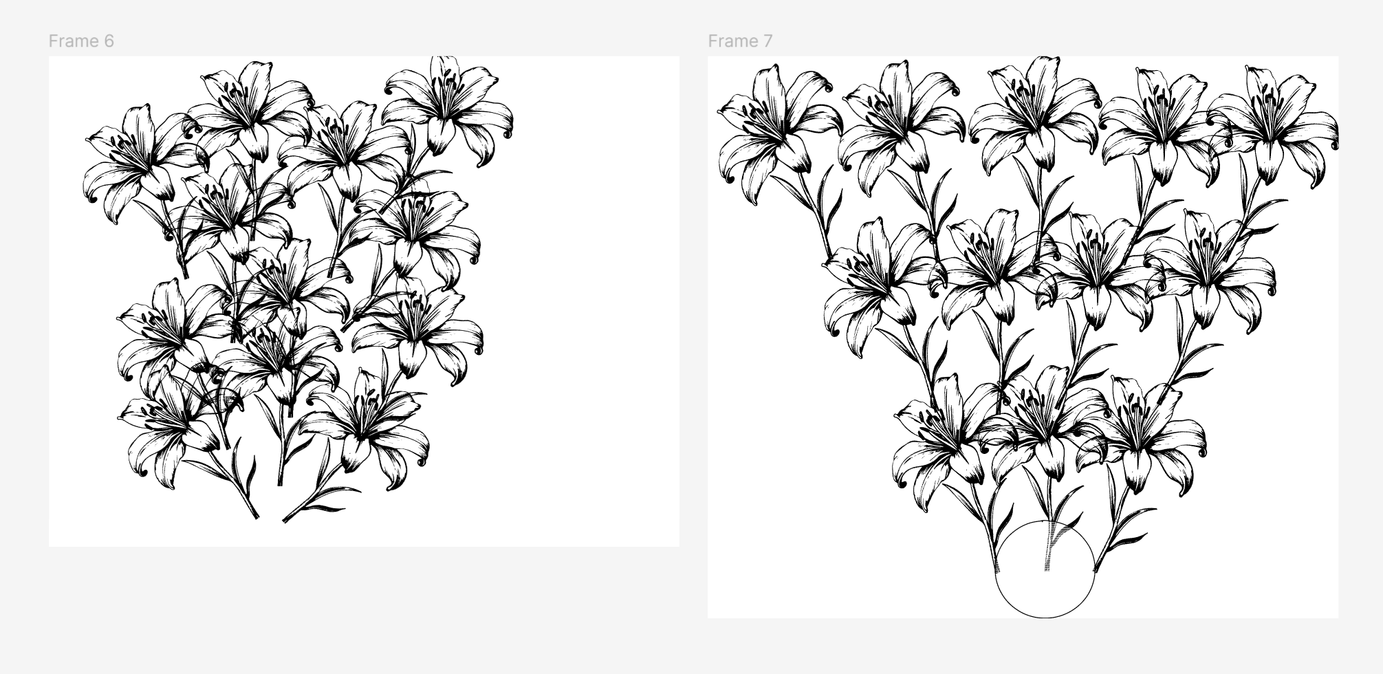
I stepped back, thinking of Federica Fragapane, a designer I admire for her use of organic shapes in data visualisation. Could I deconstruct the flowers into abstract forms? I tried sketching petals from scratch in Figma, free to add as many as I needed. But almost immediately, they lost their floral essence—again. I still craved that flower motif. Switching to chrysanthemums, with their abundant petals, crossed my mind; even broken apart, they might hold their shape. But at this point I already had a much stronger preference for using the lilies. Besides, creating something lifelike from Figma's simple shapes (circles, triangles, etc.) felt out of reach. Then it hit me: I could blend these ideas—an aerial bouquet, with a vase as an abstract circle in the centre.
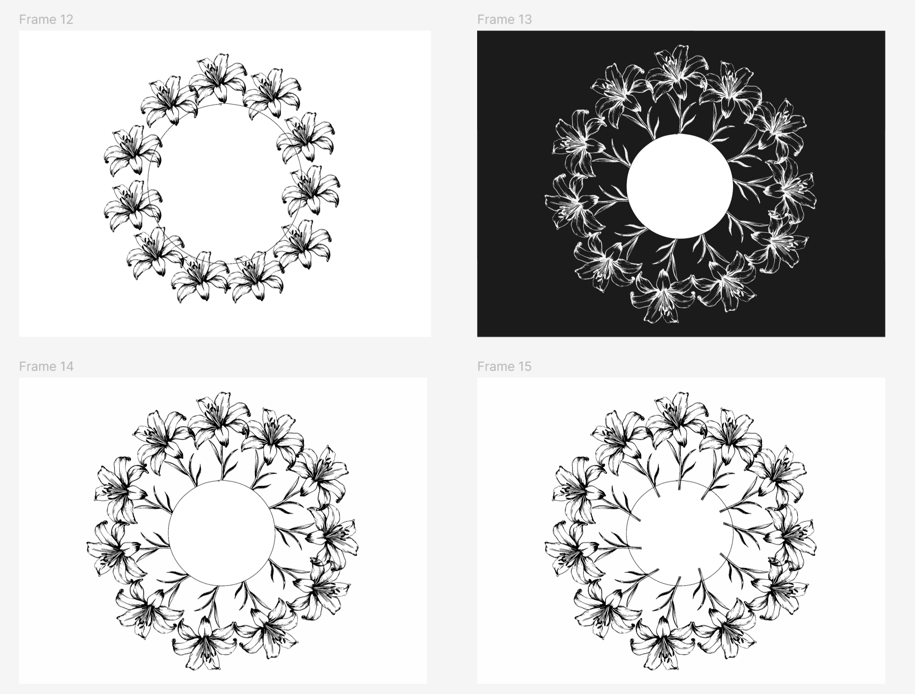
The next step was figuring out how to bring this to life in Tableau. I'd heard of polygons (something to do with custom shapes) but I knew little beyond that. So I turned to the web for inspiration. Serena Purslow's Scallop Shell viz, Kevin Wee's Dim Sum Dishes viz, and Uduak Afang's Natural Disasters viz offered hints, but what unblocked the rest of my process was Chimdi Nwosu's Sunny Street viz with its accompanying detailed tutorial. I love blogs that unpack the process; they open a whole world up for beginners, and is partly why I'm writing this one.
This section leans heavily on that tutorial, which you can find here. Tableau's map layers allow you to stack multiple elements (points, shapes, polygons, density plots) in a single view. Chimdi's viz makes clever use of this feature, and as he puts it, "This can come in handy when there are similar objects which we might want to work with as a group—it saves us from having to create a single layer for each one."
My initial data exploration had already given me the structure I needed: dimensions in a single column with corresponding values.
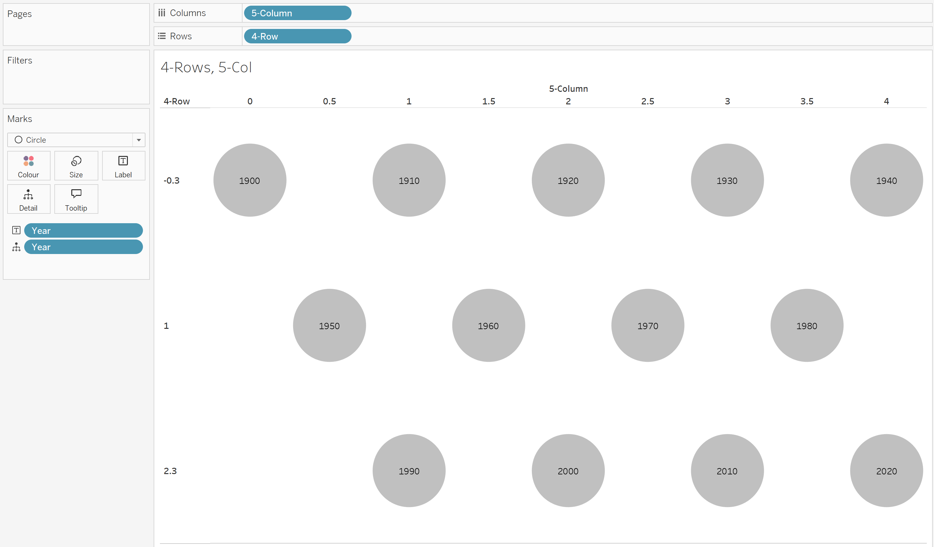
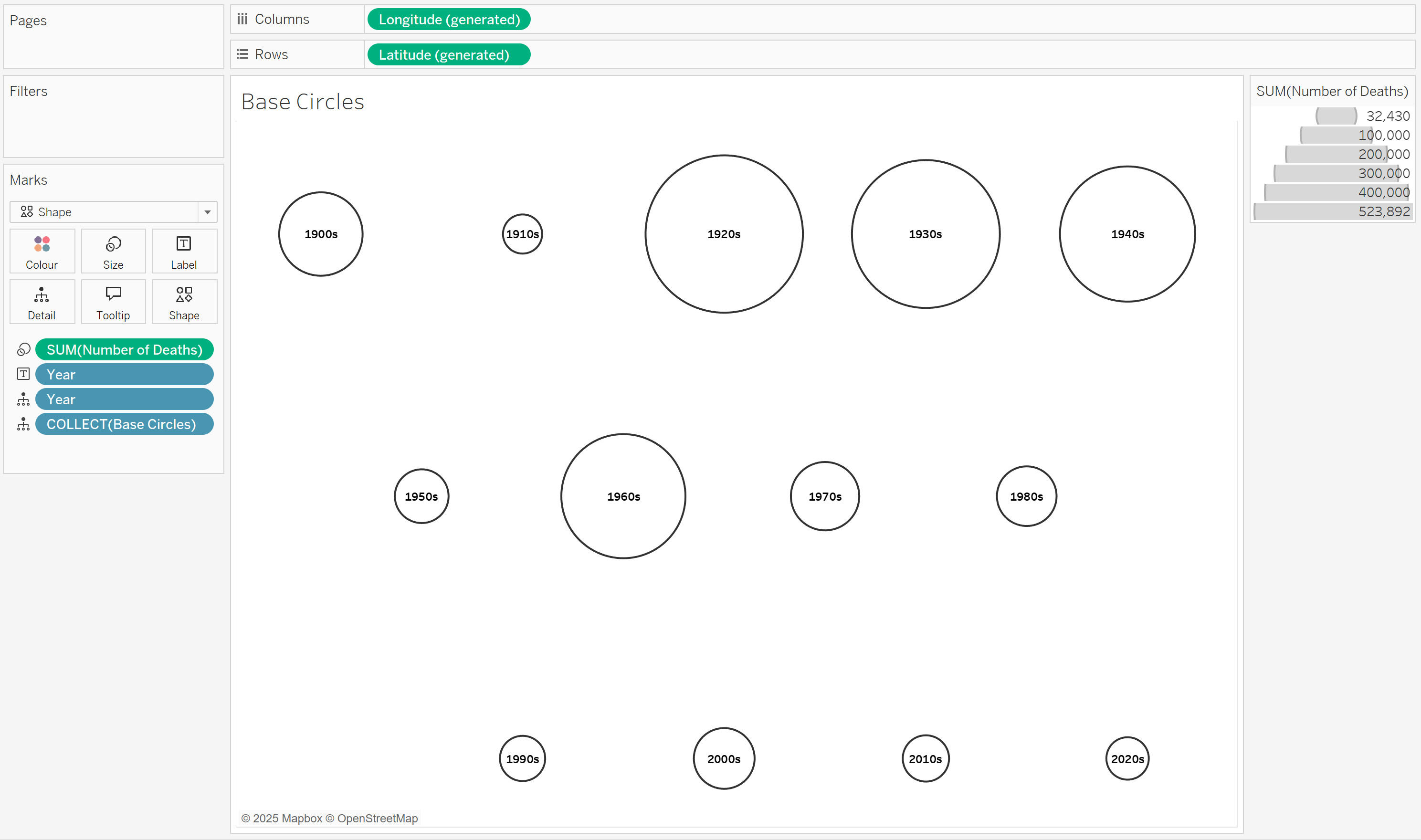
My data had 13 marks (representing decades) that I wanted to place on a grid. I created two calculations:
Rows =
IF [Year] IN (1900, 1910, 1920, 1930, 1940) THEN -0.3
ELSEIF [Year] IN (1950, 1960, 1970, 1980) THEN 1
ELSE 2.3
END
The row value is based on the year. Years are grouped into three categories, each assigned a fixed numeric row position:
These values create spaced-out horizontal bands in a custom layout.
Columns =
IF [Year] IN (1900) THEN 0
ELSEIF [Year] IN (1950) THEN 0.5
ELSEIF [Year] IN (1990, 1910) THEN 1
ELSEIF [Year] IN (1960) THEN 1.5
ELSEIF [Year] IN (1920, 2000) THEN 2
ELSEIF [Year] IN (1970) THEN 2.5
ELSEIF [Year] IN (1930, 2010) THEN 3
ELSEIF [Year] IN (1980) THEN 3.5
ELSE 4
END
The column value is also based on the year, but instead of broad groups, each year (or small clusters of years) is given a specific column position. Given the odd total number of years I was working with, I wanted to create a staggered, semi-structured layout, ensuring years don't stack directly above each other. The spacing (e.g., 0.5, 1.5, 2.5, etc.) prevents overlap and creates a more even distribution across the x-axis.
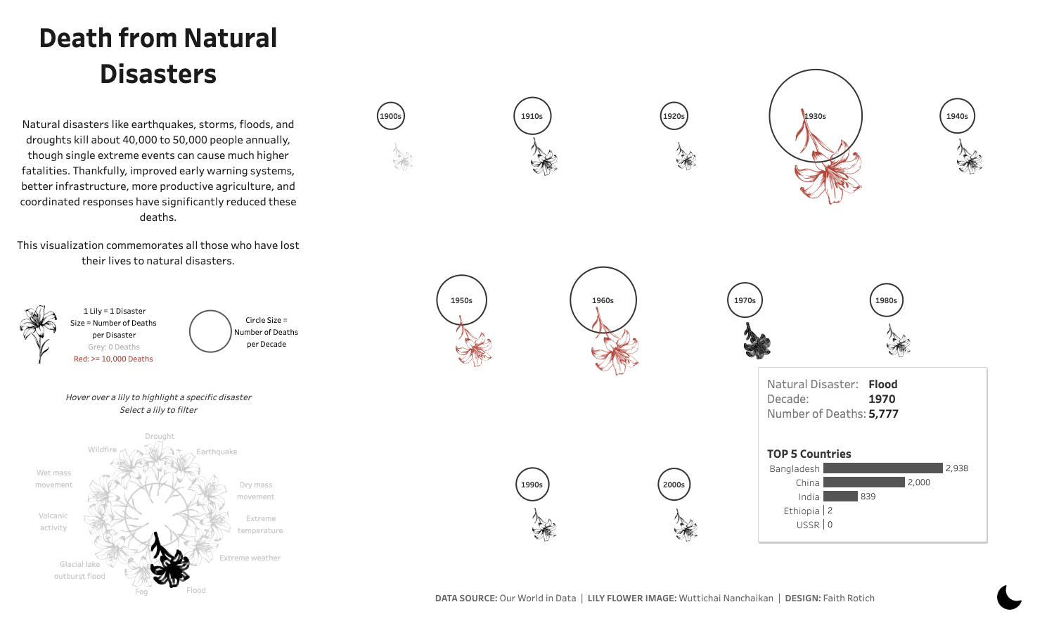
I wanted circular shapes (i.e. flower vases) to encode the total number of deaths for a given year. My calculation was:
Base Circles =
MAKEPOINT(-[4-Row],[5-Column])
The negative sign inverts the y-axis, placing earlier years at the top.
For each circular shape, I needed another calculation to place flowers around it.
Flowers =

IF [Natural Disaster] = "Drought" THEN
MAKEPOINT(-[4-Row]+0.3,[5-Column])

ELSEIF [Natural Disaster] = "Earthquake" THEN
MAKEPOINT(-[4-Row]+0.252,[5-Column]+0.162)

ELSEIF [Natural Disaster] = "Dry mass movement" THEN
MAKEPOINT(-[4-Row]+0.125,[5-Column]+0.273)

ELSEIF [Natural Disaster] = "Extreme temperature" THEN
MAKEPOINT(-[4-Row]-0.042,[5-Column]+0.297)

ELSEIF [Natural Disaster] = "Extreme weather" THEN
MAKEPOINT(-[4-Row]-0.196,[5-Column]+0.227)

ELSEIF [Natural Disaster] = "Flood" THEN
MAKEPOINT(-[4-Row]-0.287,[5-Column]+0.085)

ELSEIF [Natural Disaster] = "Fog" THEN
MAKEPOINT(-[4-Row]-0.287,[5-Column]-0.084)

ELSEIF [Natural Disaster] = "Glacial lake outburst flood" THEN
MAKEPOINT(-[4-Row]-0.196,[5-Column]-0.226)

ELSEIF [Natural Disaster] = "Volcanic activity" THEN
MAKEPOINT(-[4-Row]-0.042,[5-Column]-0.296)

ELSEIF [Natural Disaster] = "Wet mass movement" THEN
MAKEPOINT(-[4-Row]+0.125,[5-Column]-0.272)

ELSE MAKEPOINT(-[4-Row]+0.252,[5-Column]-0.162)
END
To position disaster types evenly around a circle, I needed to remind myself of some high school trigonometry (anyone remember SOH-CAH-TOA?) in order to calculate the x and y offsets from a central point. The 'Flowers' calculation adjusts the position of marks (representing different natural disasters) around a circular layout for each year by applying small offsets to the [Row] and [Column] values. Essentially, it distributes the marks evenly around a circle centered on the original grid position. How it works in more detail:
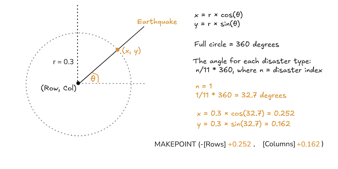
Understanding the Trigonometry
When placing points evenly around a circle, you can think of each disaster type as a point on the circumference of a unit circle (a circle with radius = 1). The key formula for calculating x and y positions around a circle is:
Where:
How I Chose Angles θ
Since I had 11 disaster types, I needed to space them evenly around the circle. A full circle is 360°, so the angle for each disaster type was:
where n is the disaster index (from 0 to 11). For example, if I wanted Flood at position 6:
Calculating the Offsets
Now, using my chosen radius (r = 0.3), I computed:
For example:
Why This Works
To bring it all together into the view, I:
I'm content with where I landed. Not flawless, but a solid intermediate deliverable. Did I answer my starting questions? Not fully, but I thoroughly enjoyed the journey through visual encoding. If I revisited this project, I'd push further toward individualization, perhaps a single flower for every life lost. But for now, I'm satisfied with this iteration.
Explore the full viz on Tableau Public here.